Covid-19 Pandemic in Ireland
As the coronavirus pandemic has swept the world, the health agencies of many nations have gathered and released data on the progression of the disease and the toll it has taken. The Government of Ireland has produced the COVID-19 Health Surveillance Monitor based on daily statistics reported by the Health Protection Surveillance Centre. As a supplement to the visualisations available on this dashboard, we’ve summed up some of the relevant data for Ireland in some simple graphs as of 2021-03-29. We sourced our data from data.gov.ie.
Work by Ciaran Prendergast and Frank Moriarty
Royal College of Surgeons Ireland
(CP is funded by the Health Research Board through grant ILP-HSR-2019-006)
A look at Recent Progress

5-day running average of Cases
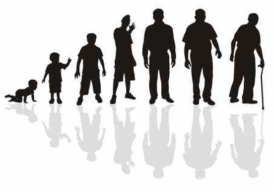
Cases by Age over last 2 Weeks
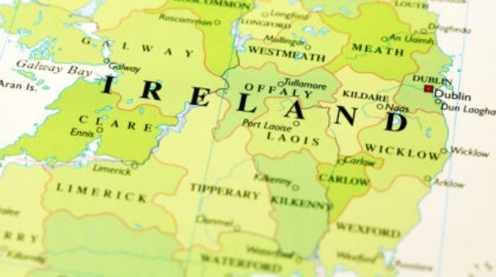
Cases by County last 2 Weeks